2025
Conceptual - UX/UI Design
UX/UI Designer
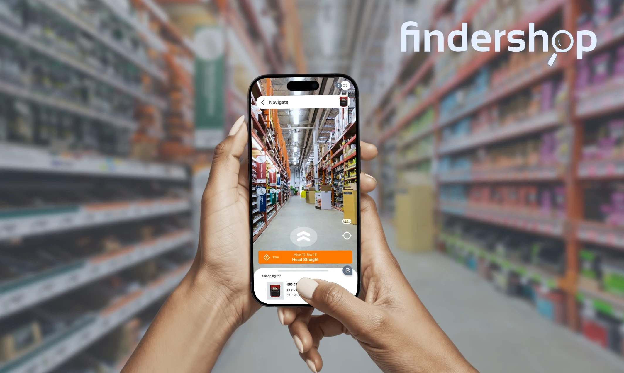
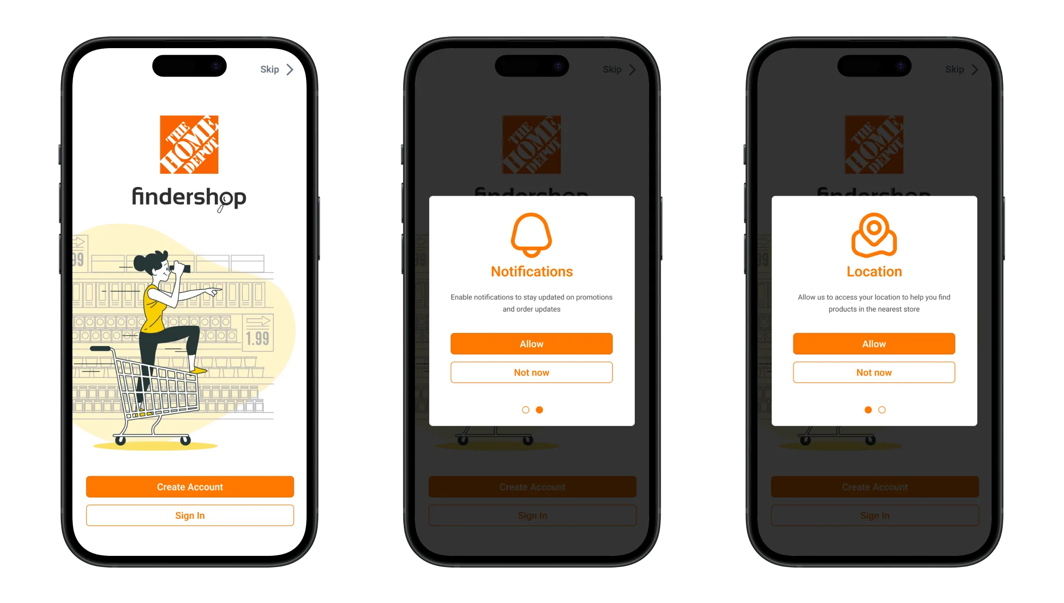
FinderShop helps you quickly find products, compare prices, and get real-time deals, all in one easy-to-use app. Whether you're shopping for home projects or everyday items, FinderShop makes in-store shopping faster and smarter.
In busy retail environments, shoppers often struggle to locate specific products, compare prices, or find the best deals. This leads to frustration, wasted time, and missed opportunities, especially for DIY shoppers or those on a tight schedule.
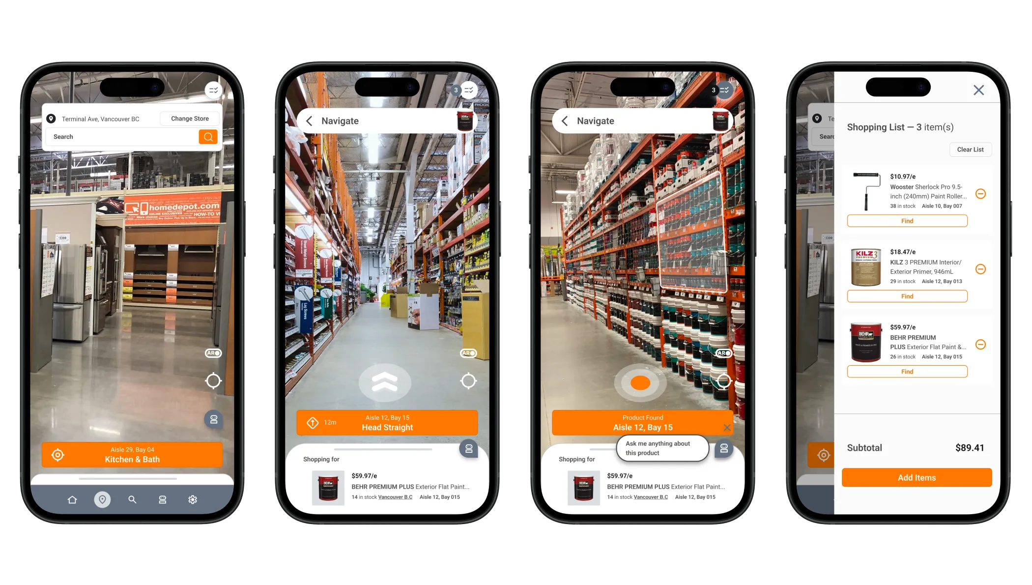
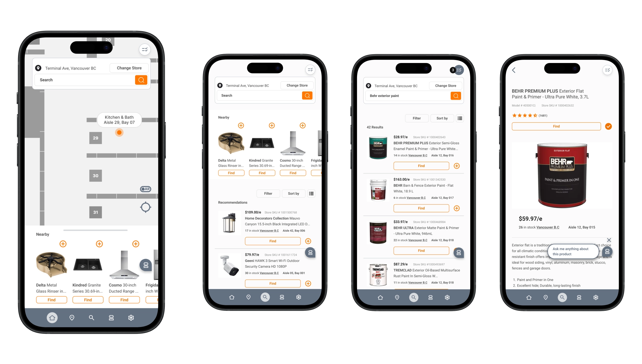
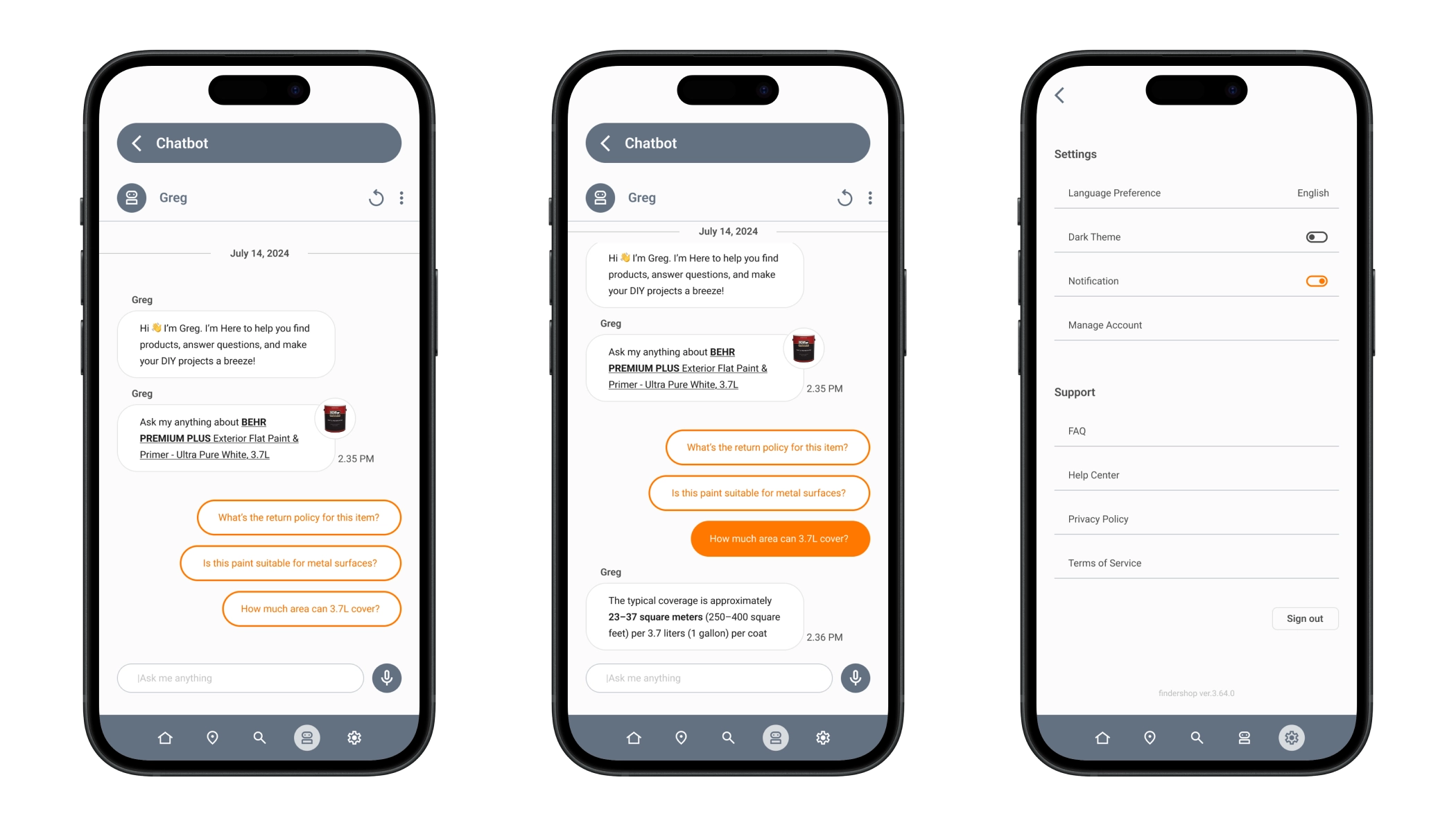
FinderShop streamlines the in-store shopping experience by helping users instantly locate products, compare prices across brands, and discover current promotions. With features like voice search, interactive maps, and personalized suggestions, FinderShop turns confusion into confidence, saving time and money with every trip.
UX Research, User Persona Development, User Journey Mapping, Wireframing, UI Design, Prototyping, Usability Testing, Branding, and Content Strategy.

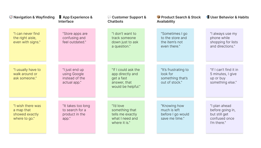
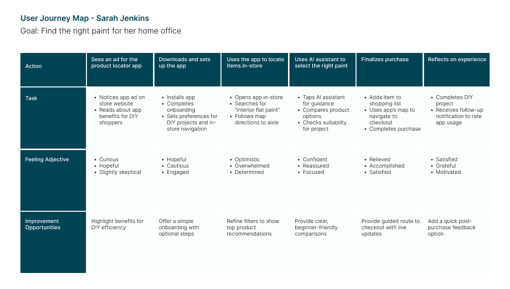
To better understand in-store shopping behaviours, I conducted three 1-on-1 interviews with frequent Home Depot customers. I asked about their experiences finding products, using store apps, and interacting with staff. Key insights revealed that most users felt overwhelmed by store size, struggled with product location, and wanted quicker, clearer assistance, without having to track down employees.
Users frequently feel lost in large stores and want quicker ways to locate products without asking staff.
Most users rely on their phones while shopping, making mobile accessibility and ease-of-use critical.
Shoppers value real-time stock availability to avoid wasted trips or aisle confusion.
Users want clear, visual guidance like maps or aisle numbers, not just text directions.
Many expressed frustration with current store apps being cluttered, outdated, or hard to navigate.
There’s a strong desire for instant help. Users were excited about the idea of an in-app chatbot for quick product questions.
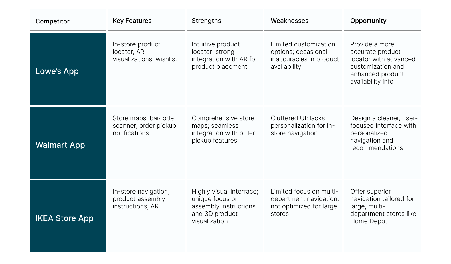
Competitive Market analysis to identify competitors' positioning in the market to define the market strategy for Finderhop's features and information structure.
After conducting user interviews, all the participants' responses were synthesized to identify themes, opportunities, and features that Findershop could focus on and improve upon.
To kick-off the design process, quick sketches helped me get ideas on paper to establish which elements were necessary for each screen.
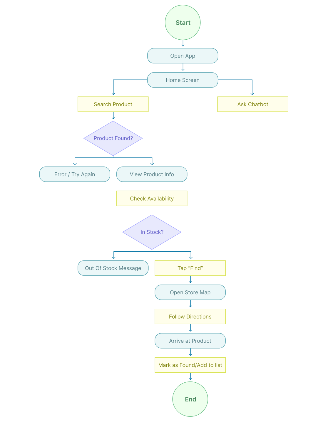
Rough sketches were done to get my initial thoughts on paper and brainstorm new ideas for specific UI elements.
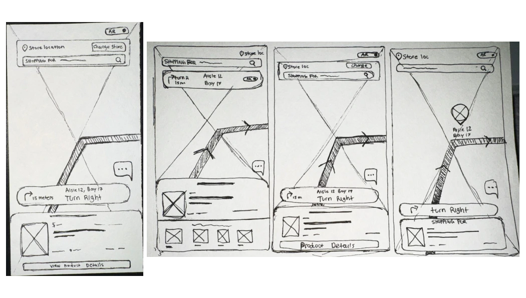
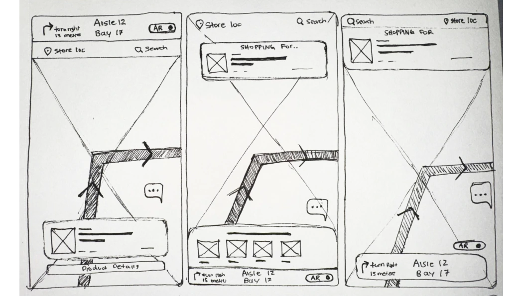
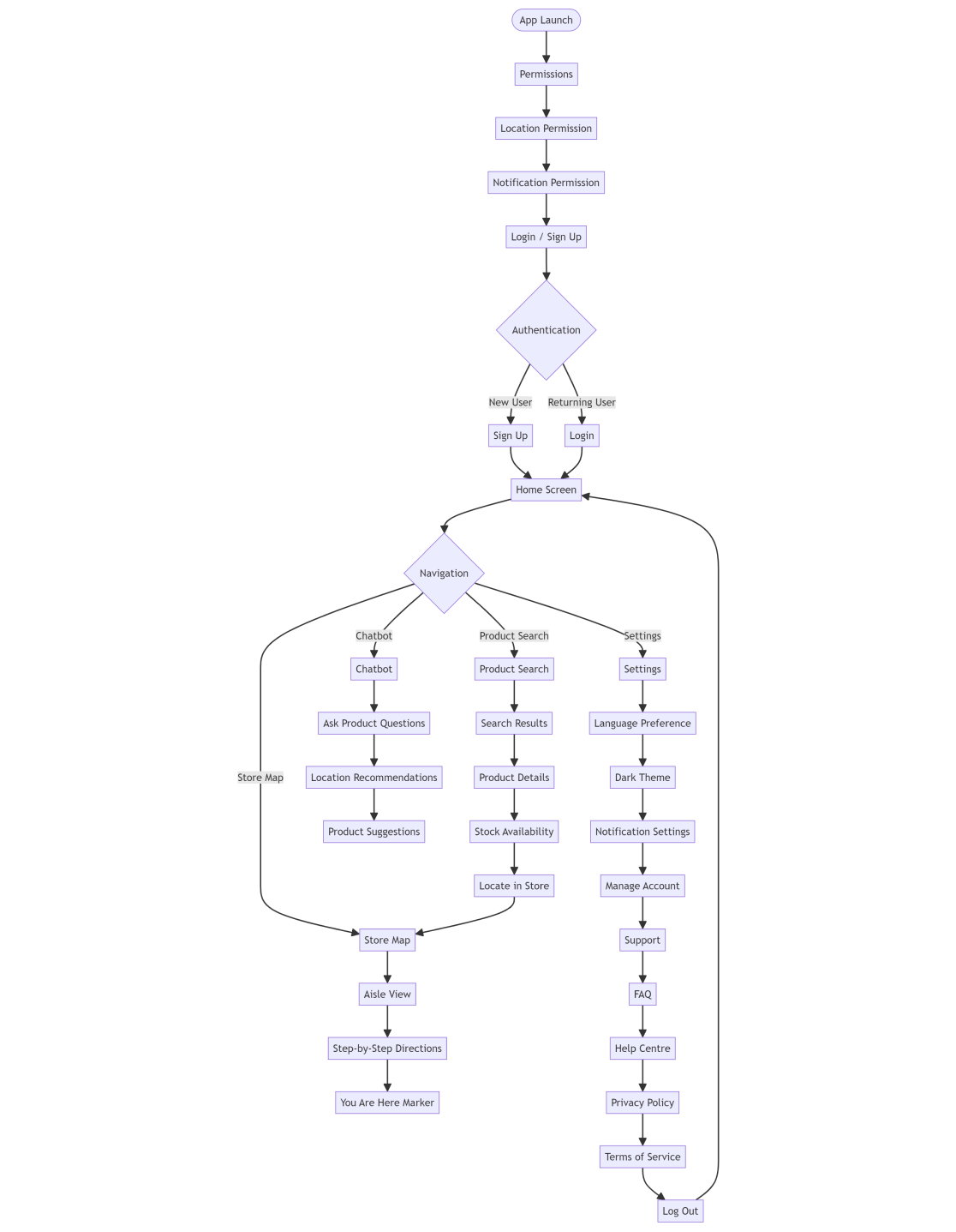
After synthesizing insights from user interviews and research, I translated the key themes and opportunities into low-fidelity wireframes. These early sketches helped visualize the core structure and layout of FinderShop, focusing on essential features like product search, in-store navigation, and chatbot access.
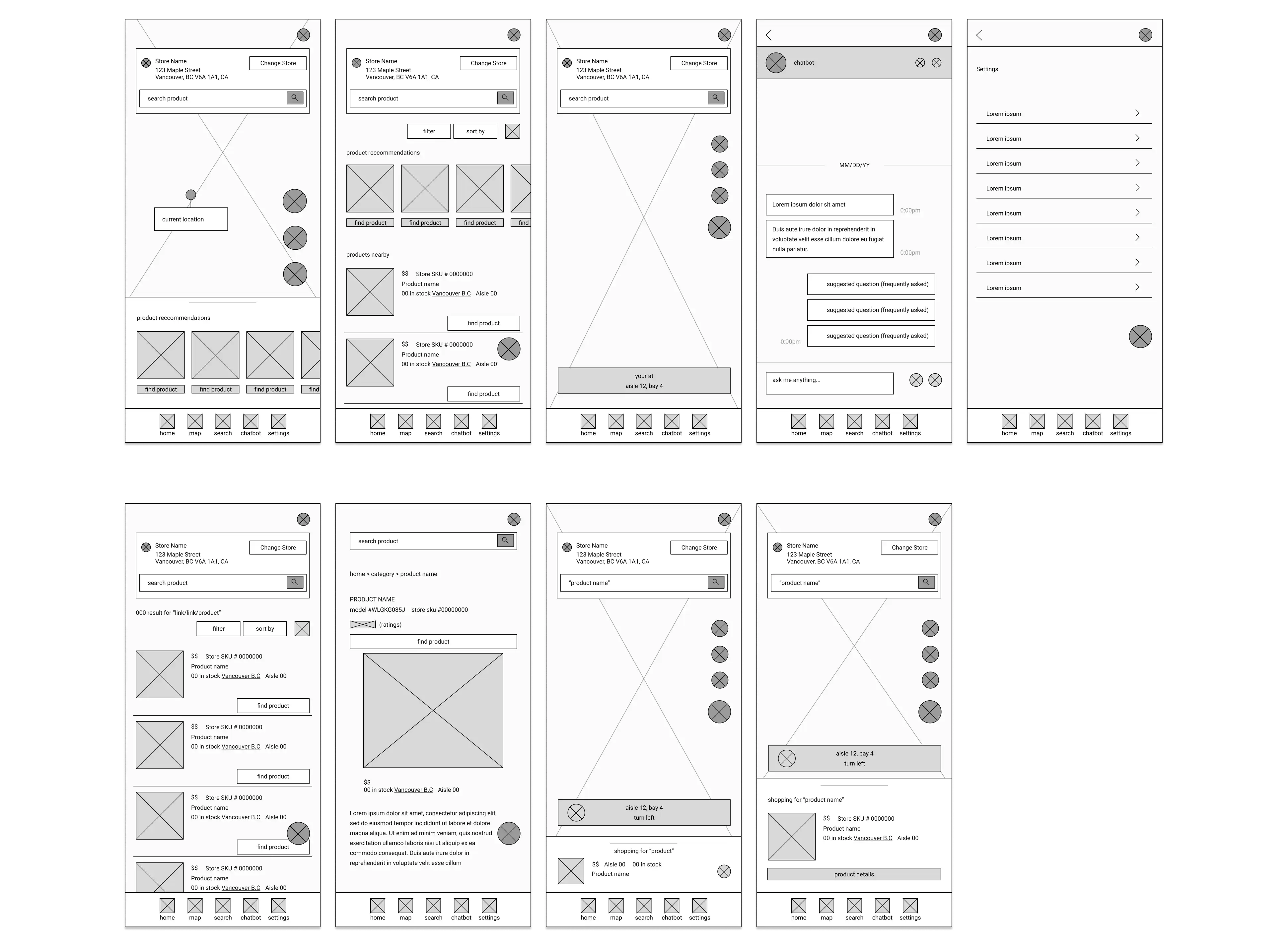
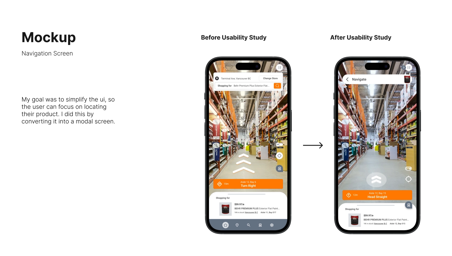
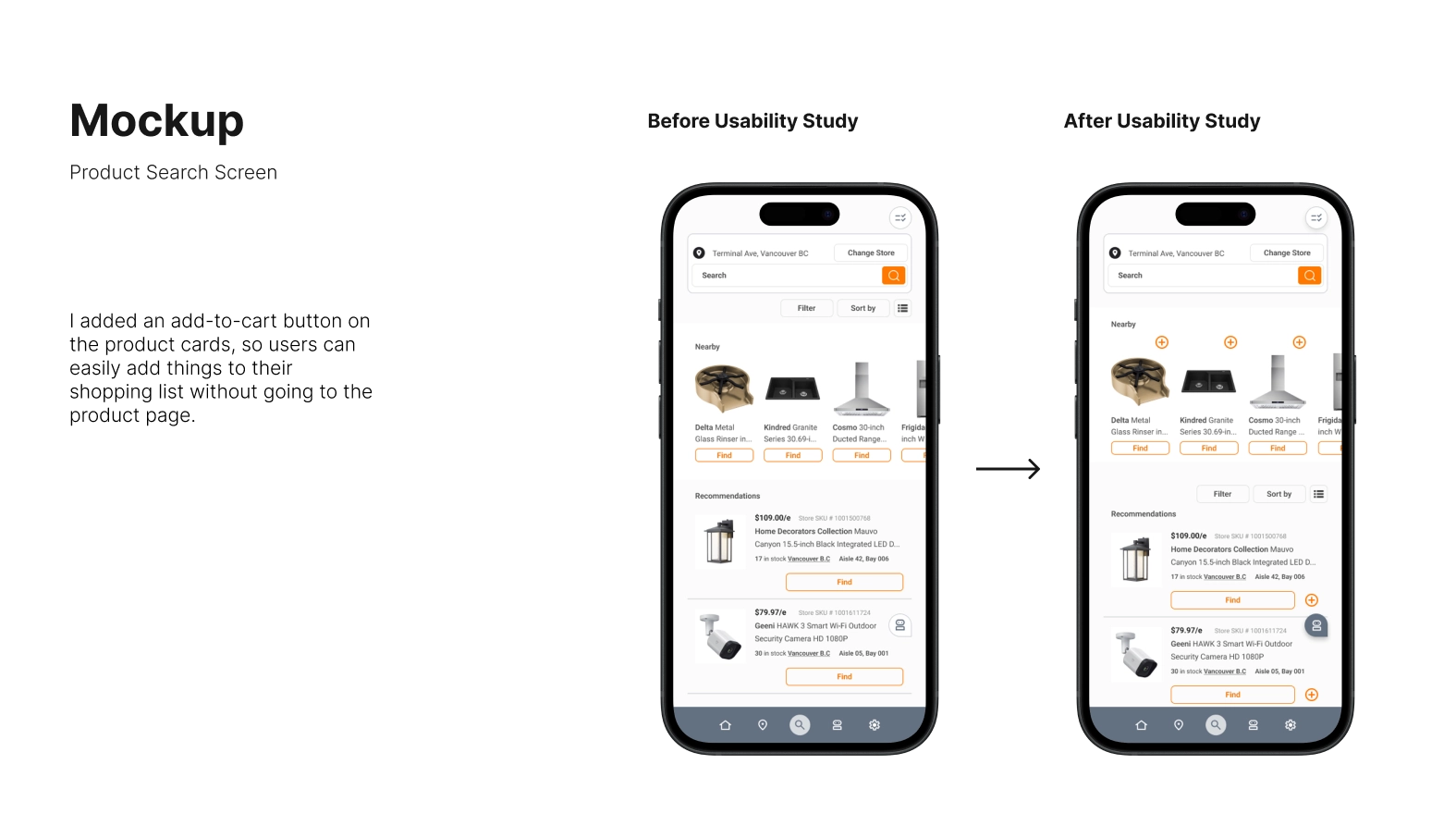
To evaluate the wireframes, I conducted a usability study with three participants who completed tasks like searching for a product, locating it on the map, and using the chatbot. Their feedback revealed areas for improvement in visibility, clarity, and flow.
Users frequently feel lost in large stores and want quicker ways to locate products without asking staff.
Replaced colours on chatbot to raise hierarchy
Users struggle locating multiple products
Added “add-to-list” button on products
Users struggled with using product nav screen (too many elements)
Simplified product nav screen by changing it into a modal screen
To validate the user experience, I conducted two rounds of usability testing using low-fidelity wireframes. Participants completed key tasks like searching for products, using the chatbot, and navigating through the store. Their feedback led to several design improvements that enhanced clarity, usability, and task flow.
The final product blends thoughtful visuals with real-world needs, wrapping up the whole journey.